
Burnt City
—branding, package design, ILLUSTRATION
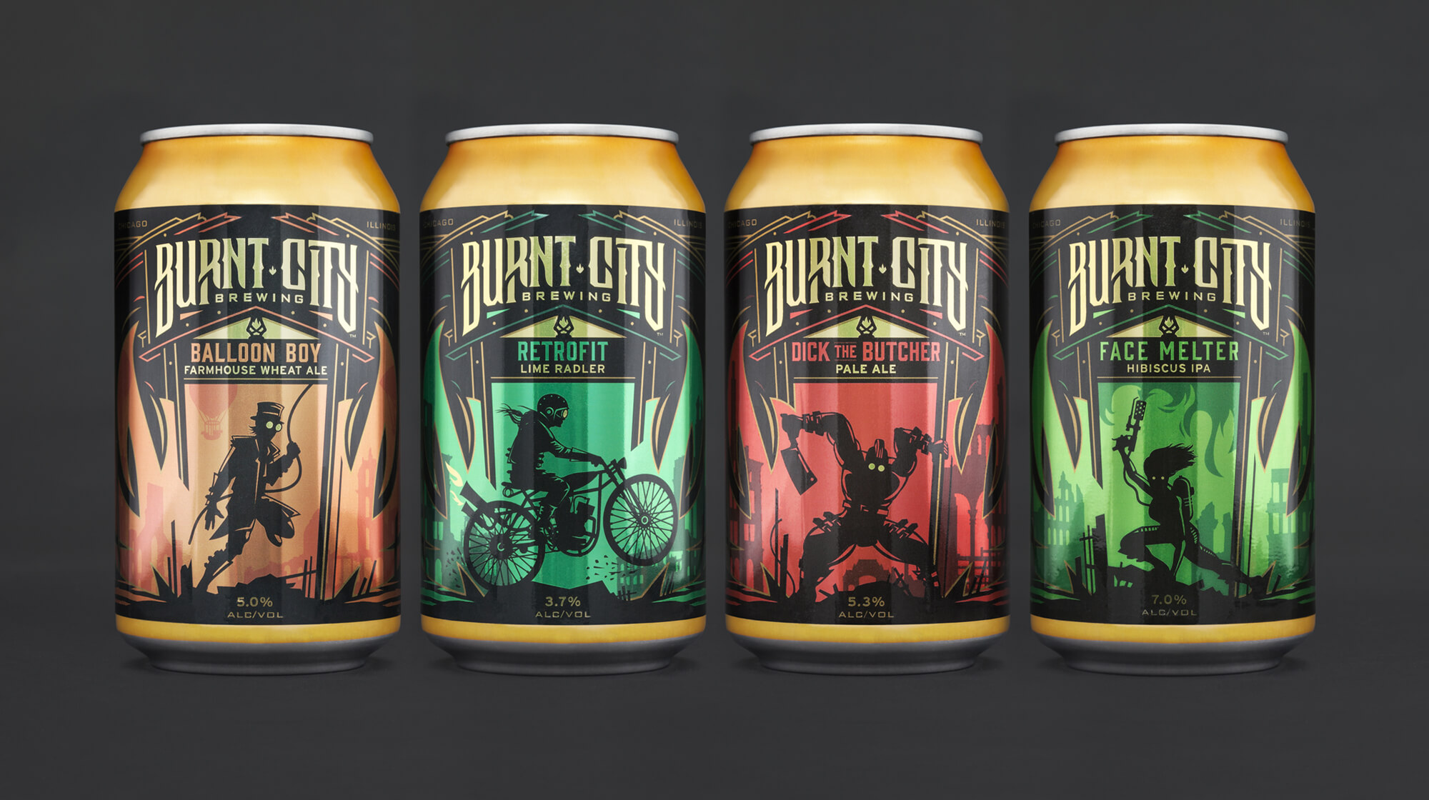
Partly a historical reference to Chicago’s Great Fire and partly the name of a fictional city, Burnt City is the narrative backdrop for each beer release. Mighty Few helped create the brand and packaging that populated this city. The identity highlights a lantern, a symbol for enlightenment and also a familiar element from the mythos of Chicago while the system created for the beers are windows into the crazy, fantastic environment of this fictional world.


We’ve worked with Mighty Few on the development of two brewery brands. When we’ve gone to them with new concepts for labels or other designs, the team has consistently come back to us with something better than we had imagined. They have a talent for listening to their clients and capturing the spirit of the products in their packaging.
BEN SALLER — FOUNDER & HEAD BREWER

© 2023 MIGHTY FEW LLC